@akli-dev/ui and the Storybook Behind It
Loading...
Loading...
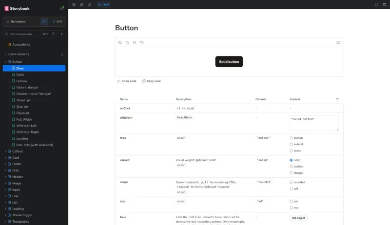
@akli-dev/ui is a small React component library: Header, Footer, Button, Typography, Input, Card, a handful more, plus the design tokens and self-hosted fonts behind them. It lives in its own repo, publishes to npm as @akli-dev/ui, and ships a public Storybook at storybook.akli.dev. The main site, the one you're reading this on, now depends on it like any other package. It didn't used to. Every one of these components used to live directly inside this site's own codebase, and pulling them out turned into a longer project than I expected, mostly because of the parts that don't show up when you're just looking at the components themselves.
The immediate trigger wasn't this site at all. I'd already built a Pokedex app at pokedex.akli.dev and a small sandbox game at sandbox.akli.dev, both living on akli.dev alongside it, and neither one shares so much as a Header component with the other today. If I want all three to eventually read as one site, rather than three unrelated projects glued together by a shared domain, they need the same header, footer, fonts, and colour tokens. Without a shared package, the only way to get that is to copy the components across, by hand, into each app.
Copy-paste like that survives exactly until the design changes. It went through a full "paper" redesign not long before this: new radius scale, new tokens, new component styling, applied one component at a time across dozens of issues. If Header and Footer had already been duplicated into two other apps at that point, every one of those changes would have needed doing three times, and the three copies would have started drifting the moment anyone forgot the third one. That's the actual argument for extracting a shared package. Not "components are reusable" as an abstract virtue, but a specific redesign I'd just lived through, which would have been three redesigns instead of one if I'd waited any longer.
So @akli-dev/ui exists to be the one place the header, footer, buttons, and tokens live, versioned, with every app depending on a release instead of a copy. This site's own migration onto the package went through four phases, tokens and fonts first, then leaf components, then interactive ones, then Header/Footer/ThemeToggle last since they sit on every single page. By the end there were no local duplicates left in its codebase at all; everything generic comes from the package now.
Once the components live in a package with no host app wrapped around them, you need somewhere to actually look at them. That's what Storybook is for, but it's doing three different jobs, not one.
The obvious one is development. Header alone has three real variants (public, admin, logged-out), and I want to see all three, in both light and dark theme, without spinning up the main site and logging in and out to trigger each state. Storybook gives every component its own story per variant, and a toolbar toggle flips the theme across all of them at once. The docs side of this matters too: Storybook's autodocs addon generates a props table straight from each component's TSDoc comments, so the documentation is the component's own type signature, not a hand-maintained README that quietly goes stale the first time a prop gets renamed.
The second job is public. Storybook is deployed openly at storybook.akli.dev, its own S3 bucket and CloudFront distribution in akli-infrastructure, the same pattern as the Pokedex and sandbox subdomains. Anyone can browse it. That makes it a portfolio artefact in its own right, a design system someone can click through without needing to know anything about the main site specifically.
The third job is the one I didn't expect to matter as much as it does: an accessibility gate that actually runs. addon-a11y runs real axe-core checks against each story in a real browser, and a real browser is the point. My existing vitest-axe component tests run in jsdom, which can catch missing labels and bad ARIA, but jsdom has no layout engine, so it can't tell you whether text actually has enough contrast against its background or whether a focus ring is visible. Storybook renders in an actual browser, so its accessibility checks cover ground jsdom structurally cannot. This isn't just eyeballing the Storybook UI by hand either; @storybook/test-runner runs the same checks headlessly in CI, so an accessibility regression fails a build the same way a broken test would.
akli.dev self-hosts Geist and JetBrains Mono, and getting that right without a layout shift on load turned out to be more than adding font-display: swap. The actual anti-shift trick is a metric-matched fallback face, 'Geist Fallback', computed with capsize so its ascent-override, descent-override, and size-adjust values match Geist Regular's box model closely enough that swapping the real font in doesn't reflow the page.
That fallback face is declared in fonts.css. It's then referenced by name inside tokens.css's --font-sans stack:
--font-sans: 'Geist', 'Geist Fallback', system-ui, sans-serif;The catch is that 'Geist Fallback' has to exist by the time --font-sans is evaluated, which means fonts.css has to be imported before tokens.css. Get the order backwards and nothing throws an error. The page still renders, the font still loads, and the only symptom is a layout shift you'd only notice if you were already looking for it. Two files, no import connecting them, and one has to load before the other or a mechanism silently stops working. That's not something a future consumer of the package can work out by reading either file on its own, so it's documented explicitly as an ordering contract in the package README rather than left as tribal knowledge.
Font preloading has a similar hidden dependency, just on the build tooling instead of CSS. When the font lived inside this site's own codebase directly, a <link rel="preload"> in its own index.html worked fine, because Vite owns that file and rewrites the source path to the final hashed build filename automatically. Once the font moves into node_modules/@akli-dev/ui, that link would have to point at a hash the consuming app's own build generates, and that hash changes on every build. A hardcoded preload tag would go stale the first time anyone rebuilt.
The fix is a small Vite plugin the package ships as a separate export:
export const preloadFonts = (): Plugin => {
  let fontFileName: string | undefined

  return {
    name: '@akli-dev/ui:preload-fonts',
    generateBundle(_options, bundle) {
      for (const asset of Object.values(bundle)) {
        if (asset.type === 'asset' && /geist-sans/i.test(asset.fileName)) {
          fontFileName = asset.fileName
        }
      }
    },
    transformIndexHtml() {
      if (!fontFileName) return
      return [{
        tag: 'link',
        attrs: { rel: 'preload', as: 'font', type: 'font/woff2', href: `/${fontFileName}`, crossorigin: true },
        injectTo: 'head-prepend',
      }]
    },
  }
}
generateBundle runs after Rollup has decided the final hashed filename, so the plugin reads the real name out of the bundle instead of guessing it, then transformIndexHtml injects a correctly pointed preload link into the consumer's own index.html. A consumer wires it into their own vite.config.ts once, and it stays correct across rebuilds because it's asking the bundler rather than hardcoding an answer.
That only works if the font shows up in the bundle as a real file with a real URL, and getting there took a wrong turn first. My first pass set build.assetsInlineLimit to explicitly exclude .woff2, on the reasonable assumption that Vite's usual base64-inlining threshold was the thing standing between the font and a preloadable URL. It built fine and did nothing, because assetsInlineLimit is dead code under Vite 8's library mode. Reading Vite's own source confirmed it: when build.lib is set, asset inlining is always forced on before assetsInlineLimit is even consulted, on the assumption that a library's output should be self-contained. The fix turned out to be a ?no-inline query suffix on the asset reference itself, added directly to each url(...) in fonts.css:
src: url('../assets/fonts/geist-sans-latin-variable.woff2?no-inline') format('woff2');That one query string was the difference between "font ships as a real file preloadFonts() can point at" and "font vanishes into the CSS as base64 with nothing for the plugin to find." Not something I'd have guessed without going and reading how Vite actually resolves inlining in library mode.
The first version of the package, v1.0.0, compiled every component's CSS into one file, dist/index.css. Simple to build, simple to import once. It also meant import { Button } from '@akli-dev/ui' shipped Button's styles and every other component's styles in the same file, whether or not anything else was actually rendered.
JS was fine. Tree-shaking already worked there, and a bundle-size CI gate confirmed unused component code got dropped. CSS had no equivalent, and the cost wasn't hypothetical. akli.dev's own Card component only renders on the admin login route, which is lazy-loaded specifically so its code doesn't weigh down every other page. Under v1's packaging, adopting Card from the shared package would have meant Card's CSS living in one eagerly-loaded global file, loaded on every page regardless of route, undoing exactly the code-splitting that already existed before extraction.
v2.0.0, a deliberate breaking change shipped through Changesets, fixed this with preserveModules on the Rollup output plus vite-plugin-lib-inject-css:
export default defineConfig({
  build: {
    lib: { entry: 'src/index.ts', formats: ['es'] },
    cssCodeSplit: true,
    rollupOptions: {
      output: { preserveModules: true, preserveModulesRoot: 'src' },
    },
  },
  plugins: [libInjectCss(), dts()],
})
Each component's compiled JS now carries its own import of only its own CSS, so a consumer's bundler tree-shakes unused component styles the same way it already tree-shook unused component code. I considered the other obvious fix, shipping one CSS file per component that consumers import by hand, the way early Ant Design did it, and rejected it. That pattern reintroduces the classic trap where you forget the CSS import and get an unstyled component with no error telling you why.
One subtlety cost real debugging time. A few components share styles across files using CSS Modules' composes::
.button {
  composes: focusRing from '../../styles/interactions.module.css';
}
Under preserveModules, a composes: reference doesn't get deduplicated. Each file that composes it inlines its own copy of that CSS. A genuine JS import of the same module, by contrast, does get correctly hoisted into one shared chunk by the bundler. The fix was converting the shared composes: usages into real JS imports merged at render time with a small cx() helper, since that's the only mechanism that actually gets deduplicated once the build stops flattening everything into a single file.
Extracting the components into a public package also meant adding accessibility test coverage that hadn't existed before at the component level. This site only had vitest-axe checks at the page level, on Home or the recipe views, never on Header or Button in isolation. A component published for other apps to depend on needed that coverage on its own terms, plus a dedicated script re-deriving WCAG AA contrast ratios for every token pairing, since neither jsdom nor Storybook's axe-core can reliably judge colour contrast, plus one manual keyboard-only pass, tab order, visible focus, no traps, before the first release went out. None of that carried over from before. It was new work the extraction created.
The npm package and Storybook release on entirely different triggers, and I settled on that on purpose rather than by accident.
The npm side uses Changesets. Merging a PR that includes a changeset file opens or updates an automated "Version Packages" PR, and only merging that second PR actually runs npm publish, over OIDC trusted publishing, so there's no npm token sitting in a GitHub secret anywhere. Storybook ignores all of that. It redeploys to storybook.akli.dev on every single merge to main, whether or not that merge touched anything version-worthy, because Storybook's job is to reflect what's currently on main, not to track a specific published version.
The two audiences want different things from a release. Someone depending on @akli-dev/ui@2.1.0 in a build wants a stable, semver-versioned artefact that doesn't move under them. Someone browsing the Storybook wants to see what's actually true right now. Coupling those two into one pipeline would have made one of them worse to satisfy the other.
Nothing catches a visual regression today. Accessibility violations fail loudly, but a component that renders subtly wrong, a spacing value off by a few pixels, a colour that shifted, gets through everything green. Chromatic or a Playwright screenshot diff is the obvious next step, deliberately left out of v1 while the component set was still moving too fast for a baseline to mean anything. It's worth adding once fewer things are actively changing shape.
The CSS tree-shaking work is exactly the kind of thing that regresses silently. It already needed catching once, which is why check:css-tree-shaking exists as a CI gate rather than something I just remember to check. I'd rather it stay a boring, green check forever than find out the hard way that a future composes: sneaked back in.
Longer term, I'd like the font and token system to support more than one visual identity, in case akli.dev ever grows a sub-brand that wants to look a little different while still sharing the same underlying primitives. And a changelog view generated straight from the Changesets output, rendered inside Storybook itself, would close the loop nicely: one place to see both what a component looks like and what changed about it recently, instead of sending someone to GitHub's release page to find out.
You can browse the components at storybook.akli.dev.